KH Events had grown into a full-service operation — planning, decor, catering and equipment hire — but its identity still reflected an earlier, narrower event-service business. The brand looked busier than the work it represented, and it lacked a consistent system to keep it coherent across documents, uniforms, print and social.
The task was an evolution, not a restart: refresh the brand without losing recognition, then give it the discipline to hold together across every touchpoint — and keep it consistent over a multi-year working relationship.
We began with the brand heart — what KH Events stands for and how it should sound — and let that shape the refresh. From there we evolved the identity from an older monogram into a cleaner, more elegant geometric mark, then built the colour, typography and pattern system around it.
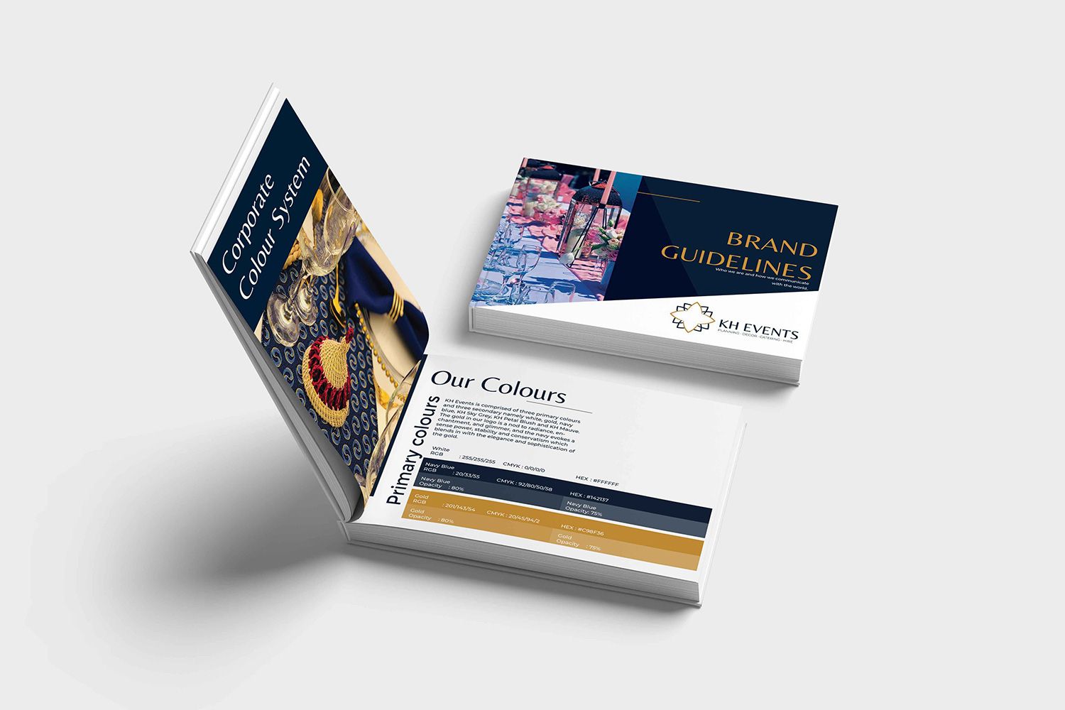
To make the refresh last, we documented it in a 36-page brand guideline. That gave KH Events a single source of truth for internal documents, digital and social, co-branding, print and uniforms — so the brand stayed consistent long after the first rollout.
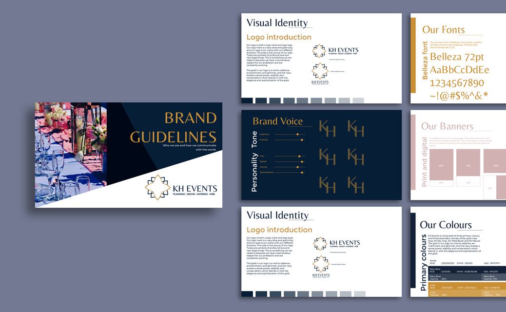
The brand guideline system — the rulebook that kept the refresh consistent across every application
The heart of the refresh was the mark itself. We moved KH Events away from its older monogram toward a refined, geometric blooming-tulip symbol — a more elegant signature that better matched the decor and catering work, while staying recognisably KH.
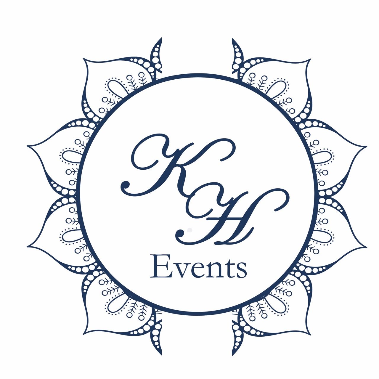
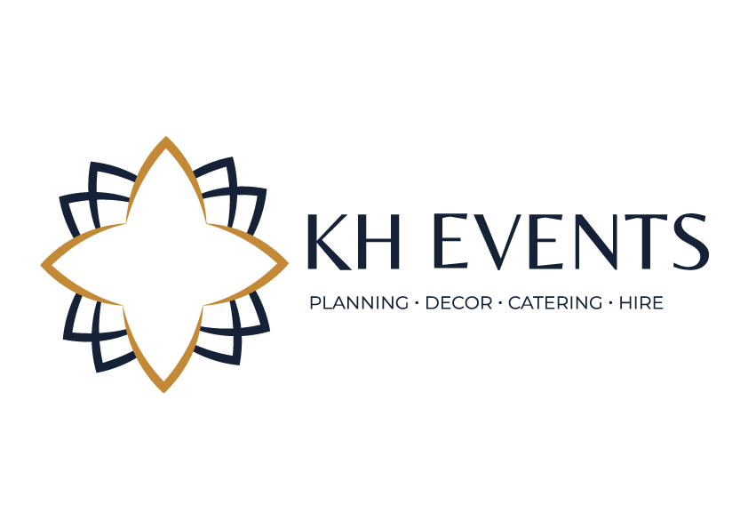
Old to new — the original monogram, refreshed into the geometric blooming-tulip mark

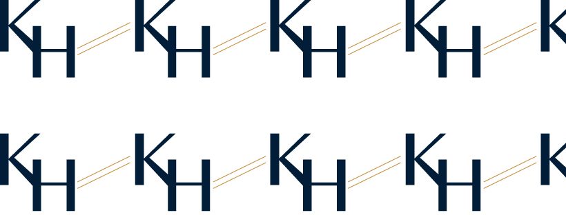
The icon and a supporting KH pattern — flexible brand assets built from the core mark
A palette built for elegance — deep navy for authority, warm gold for occasion, and a set of soft neutrals to let the brand breathe across documents, print and social.
A refresh only proves itself in use. We took the KH Events identity across the touchpoints the business relies on every day — social media, branded uniforms and embroidery, and print advertorials — so the brand showed up the same way everywhere.
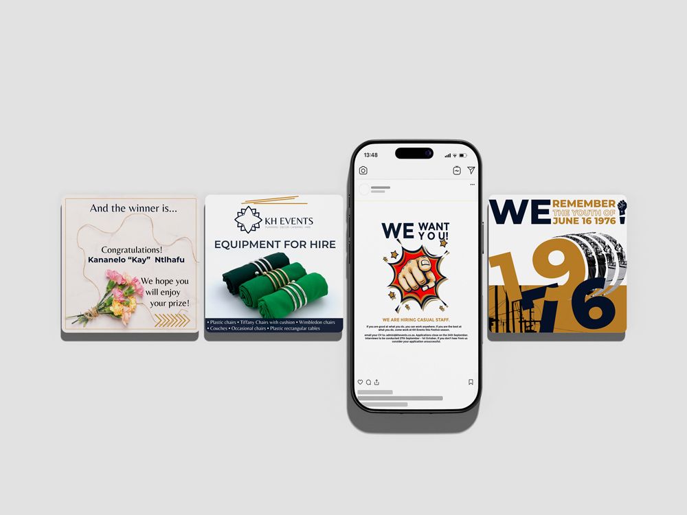
Social media content — the refreshed identity applied to branded posts

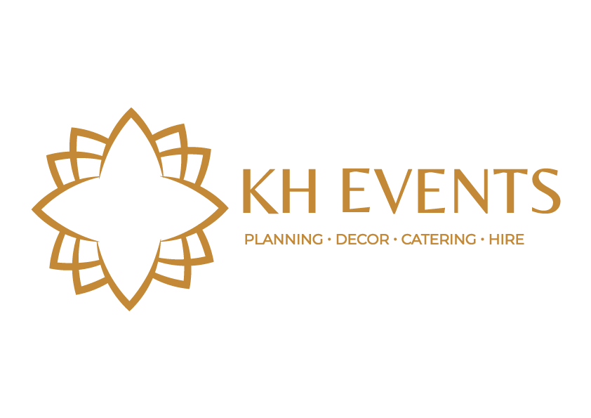
Uniform and embroidery — the gold mark prepared for branded staff wear
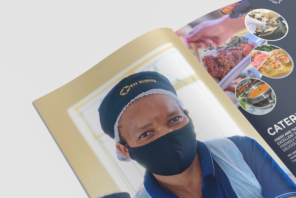
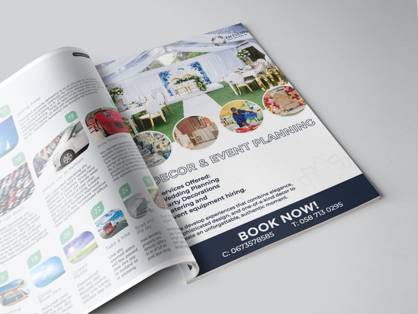
Print advertorials, 2021 and 2022 — the brand carried into editorial advertising
Everything KH Events needed to look — and stay — consistent, from the strategic foundation to the pieces staff wear and clients read.
"A refresh isn't a new brand.
It's the same brand, finally consistent."
Portfolio Creative — KH Events Brand Refresh
The refresh gave KH Events a more refined, consistent identity that positioned it as an elegant events, decor, catering and hire brand. With a documented system in hand, the team could apply the brand confidently across internal documents, digital and social, co-branding, print and uniforms — and keep it consistent well beyond the first rollout.