Back to all work
Sixty 9 · 2024

Built to be the table everyone asks for.

Hospitality Brand

Sixty 9 is a hospitality destination that needed more than a logo — it needed an identity with atmosphere. Portfolio Creative built the brand from the ground up: strategy, a full logo system, a rich indigo-and-gold palette, and every applied piece a guest sees, from the menu in their hands to the signage on the street.

Client
Sixty 9
Sector
Hospitality
Restaurant & Bar
Year
2024
Timeline
2 months
Brand Strategy Brand Identity Ad Design
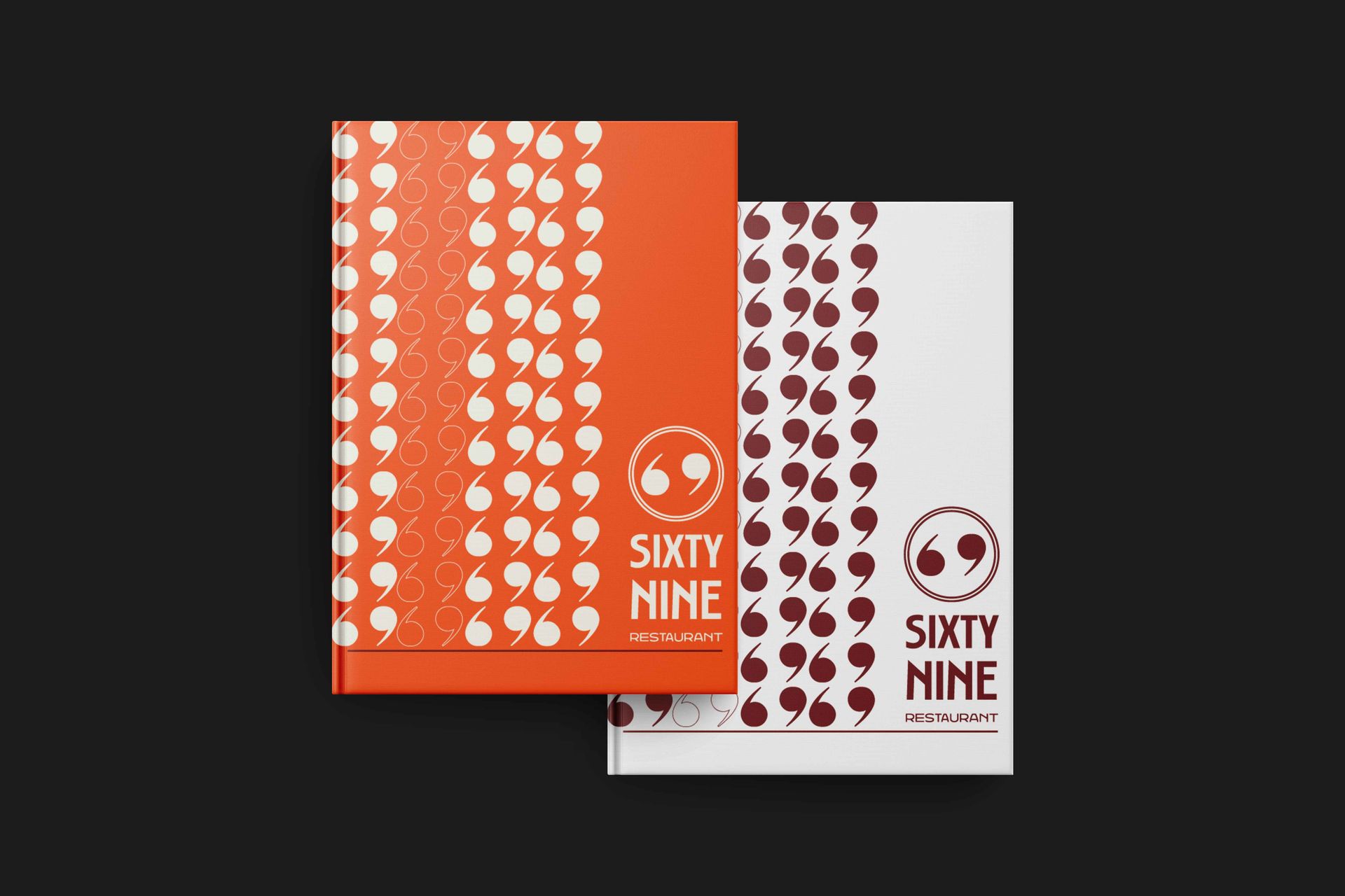
Sixty 9 restaurant menu design — indigo and gold brand identity applied to the printed menu
The Challenge

A new name in a
crowded room.

Hospitality is one of the hardest categories to stand out in. Guests decide how they feel about a venue before they taste a single thing — from the sign on the street to the menu on the table. Sixty 9 was new, and it needed an identity that felt established, confident and worth choosing.

The brief was a complete one: not just a mark, but a full brand world — strategy, identity and every applied touchpoint — built to feel cohesive and premium across print, signage and outdoor, all within a tight two-month window.

1
Brand built end to end — from naming strategy through to applied identity
2
Logo systems — a primary lockup and a secondary mark for flexible real-world use
7
Colour palette — a considered indigo, gold and burgundy system with room to breathe
Our Approach

Start with feeling,
then design the proof.

Before a single mark was drawn, we defined what Sixty 9 should feel like: warm, considered and quietly premium — a place with a point of view. That strategy became the brief for everything that followed.

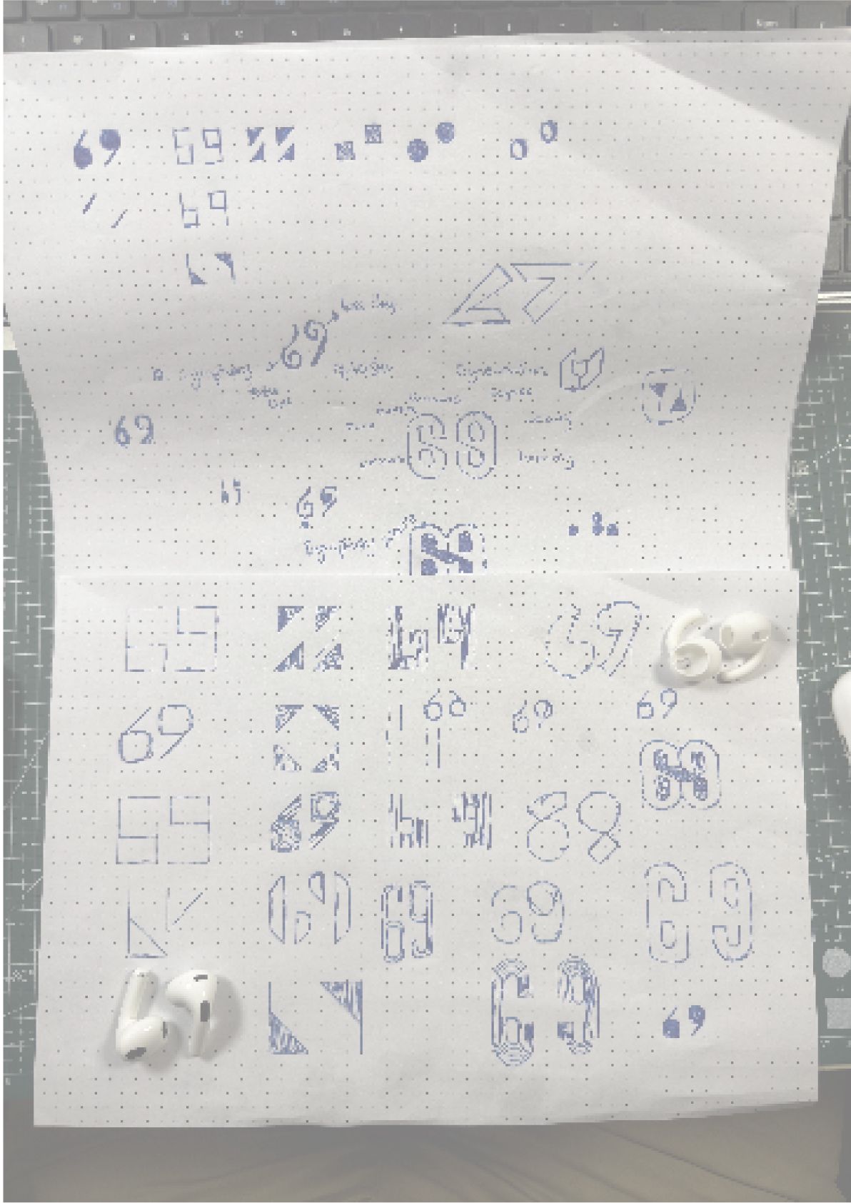
From there we explored the identity on paper and on screen — testing how the name, the numerals and the supporting marks could carry the brand. The result is a system with personality and discipline in equal measure: distinctive enough to remember, flexible enough to live everywhere a guest meets it.

Sixty 9 brand identity exploration board — early logo directions, type and visual language studies

Identity exploration — testing the direction before committing to the final system

The Identity

One mark, built
to work everywhere.

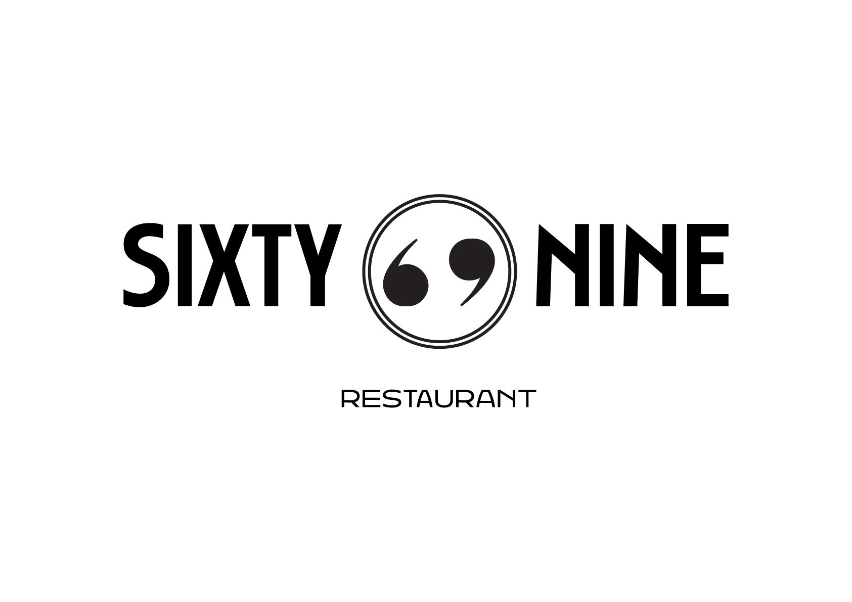
The final identity centres on a confident primary lockup, supported by a secondary mark for the moments where space is tight or scale is small. Together they give Sixty 9 a flexible toolkit that stays unmistakably itself across every format.
Primary Lockup
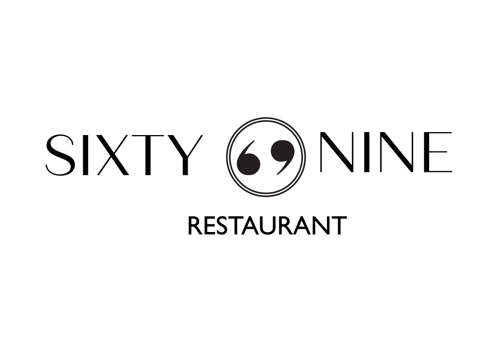
Sixty 9 primary logo lockup — the main brand mark in indigo and gold

The primary Sixty 9 lockup — the brand's signature mark
From Sketch to Alternate Lockup
Sixty 9 identity — early hand sketches of the logo concept
Sixty 9 alternate logo lockup — secondary configuration of the brand mark

From first sketches to the alternate lockup — the same idea, refined

Colour Palette

Indigo and gold,
with depth to spare.

A palette built for atmosphere — deep indigo and burgundy for richness, gold for warmth and occasion, and soft neutrals to let it all breathe across print and signage.

Indigo
#4B0082
Gold
#D4AF37
Burgundy
#800020
Forest Green
#014421
Charcoal
#36454F
Ivory
#FFFFF0
Beige
#F5F5DC
Brand Applications

The brand,
out in the world.

A brand only earns its keep when it leaves the artboard. We took the Sixty 9 identity across every touchpoint a guest actually encounters — stationery, signage, outdoor advertising and the venue itself.
Outdoor Advertising
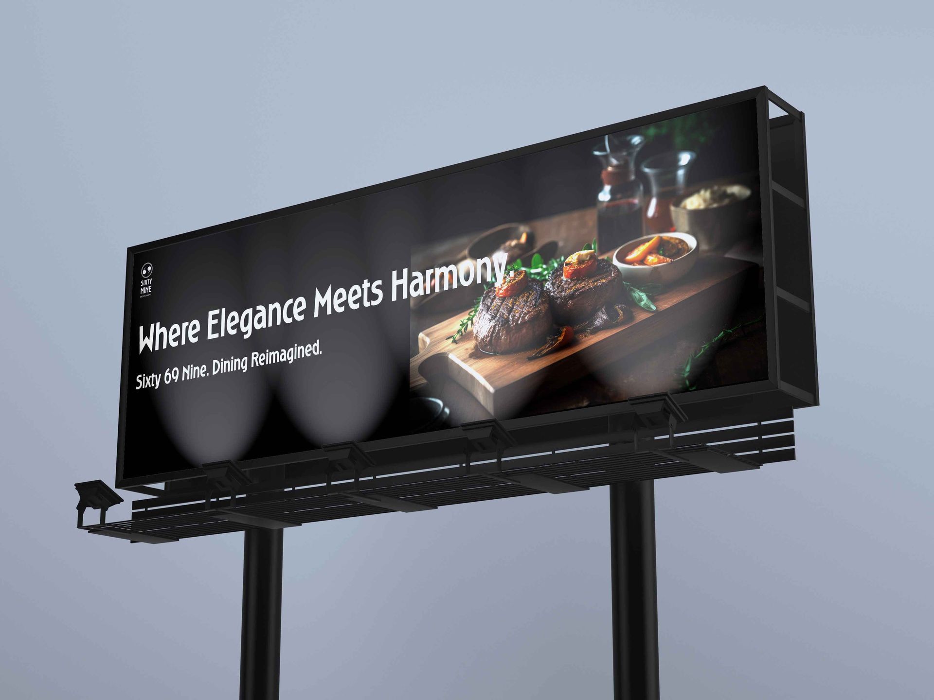
Sixty 9 out-of-home billboard — the brand identity applied to a large-format outdoor advertisement

Out-of-home billboard — the brand at full outdoor scale
Signage
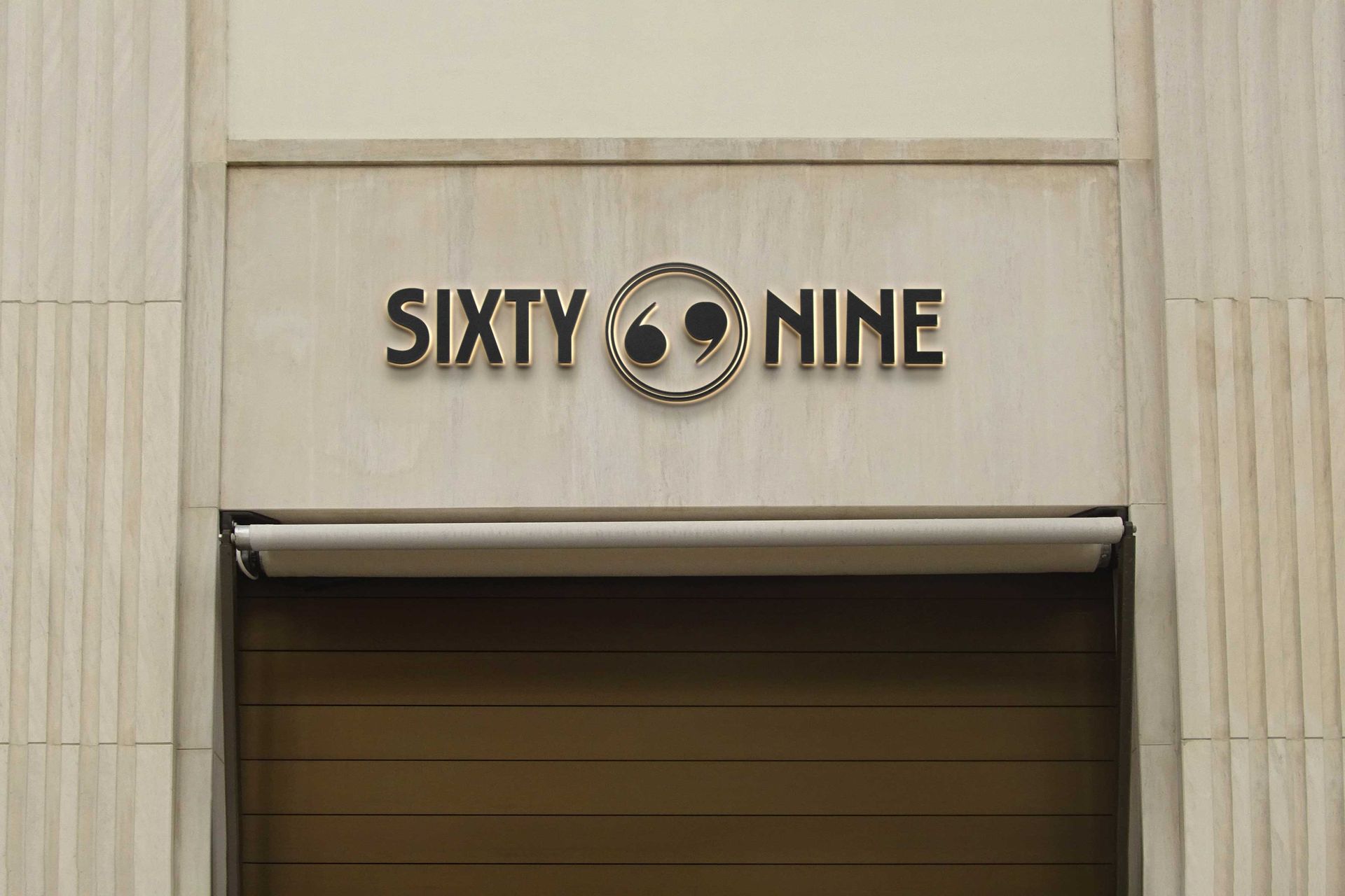
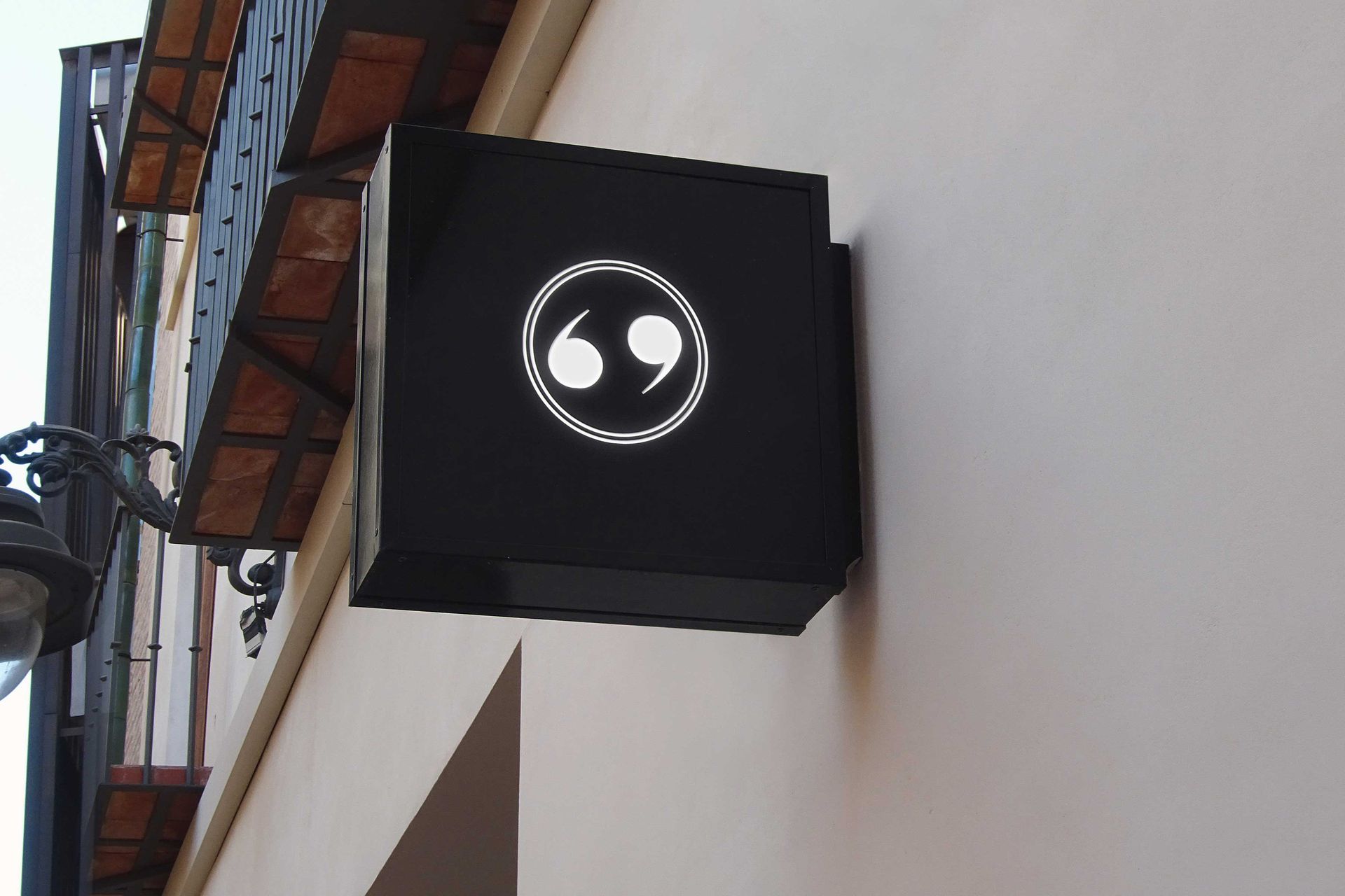
Sixty 9 exterior signage — branded venue signage on the building facade
Sixty 9 loading bay signage — branded wayfinding signage applied on site

Exterior and on-site signage — the identity as wayfinding and street presence
Stationery & Print
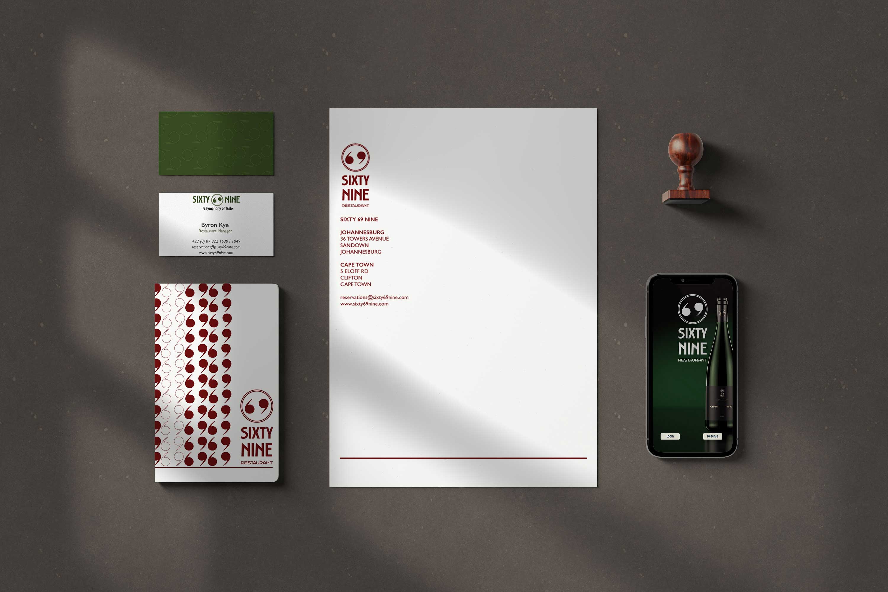
Sixty 9 stationery suite — branded business cards and print collateral in indigo and gold
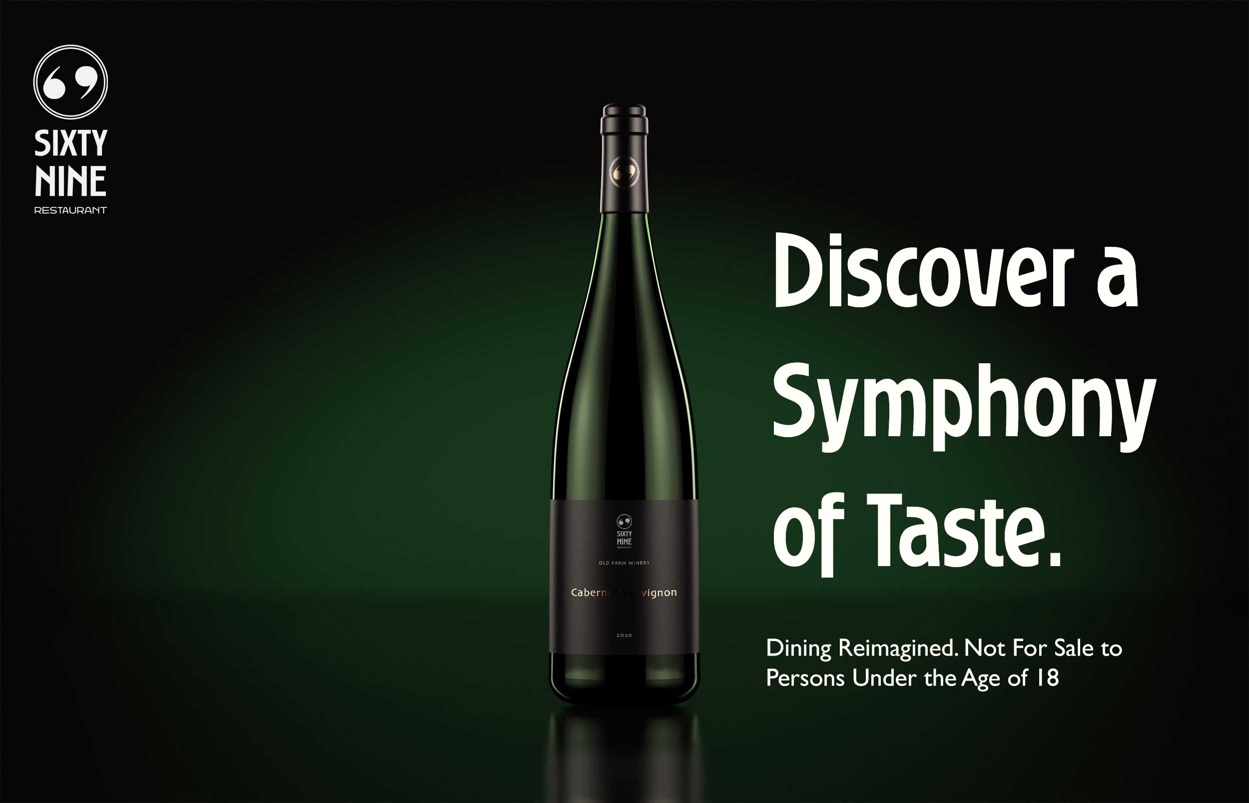
Sixty 9 wine banner — branded promotional banner for the venue's wine offering

Stationery and promotional print — the brand applied across everyday collateral

Deliverables

Everything Sixty 9
needed to open.

A complete brand toolkit — from the strategic foundation to the pieces guests hold, read and walk past.

Brand Strategy
The positioning and personality that defined how Sixty 9 should look, feel and behave.
Logo System
A primary lockup and a secondary mark, built for flexible use at every scale.
Colour Palette
A seven-colour system led by indigo and gold, defined for print, signage and screen.
Menu Design
A branded menu that carries the identity into the guest's hands at the table.
Signage & OOH
Exterior signage, on-site wayfinding and an outdoor billboard for street presence.
Stationery & Print
A coordinated stationery suite and promotional print, including the venue's wine banner.

"A brand isn't the logo.
It's everything the guest touches on the way to the table."

Portfolio Creative — Sixty 9 Brand Identity
Start a project
Opening something new?
Let's build the brand.
Start a project